Section
Work Section
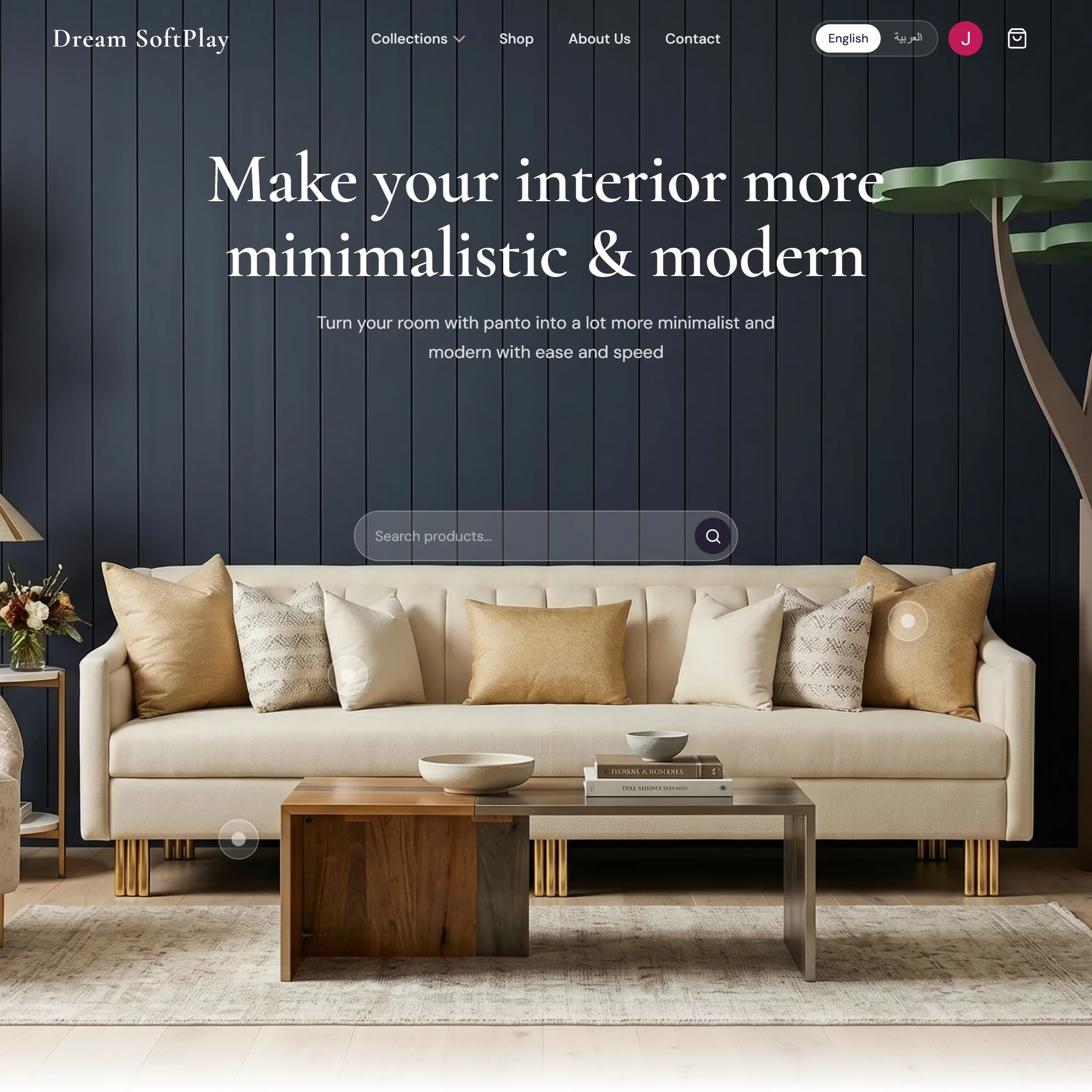
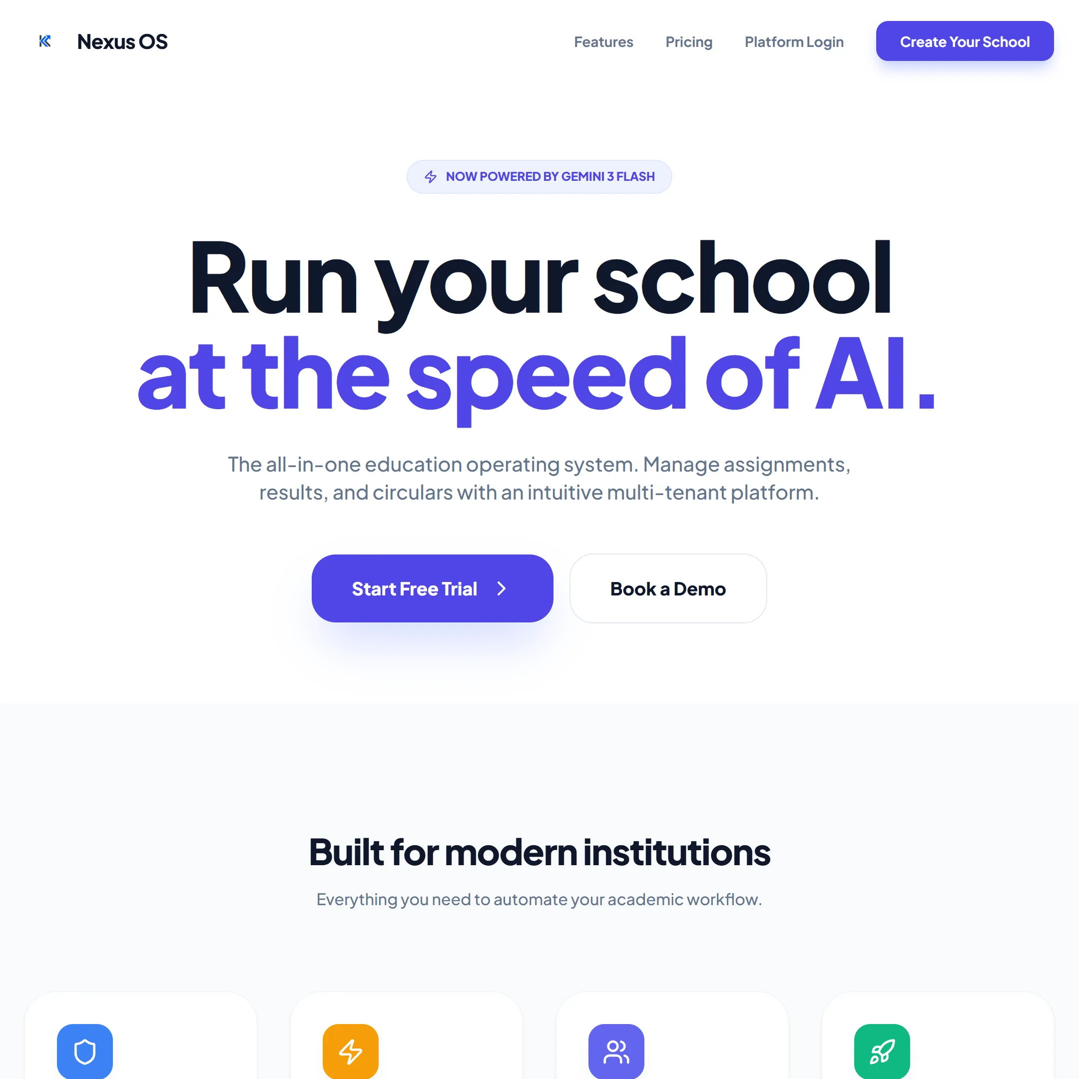
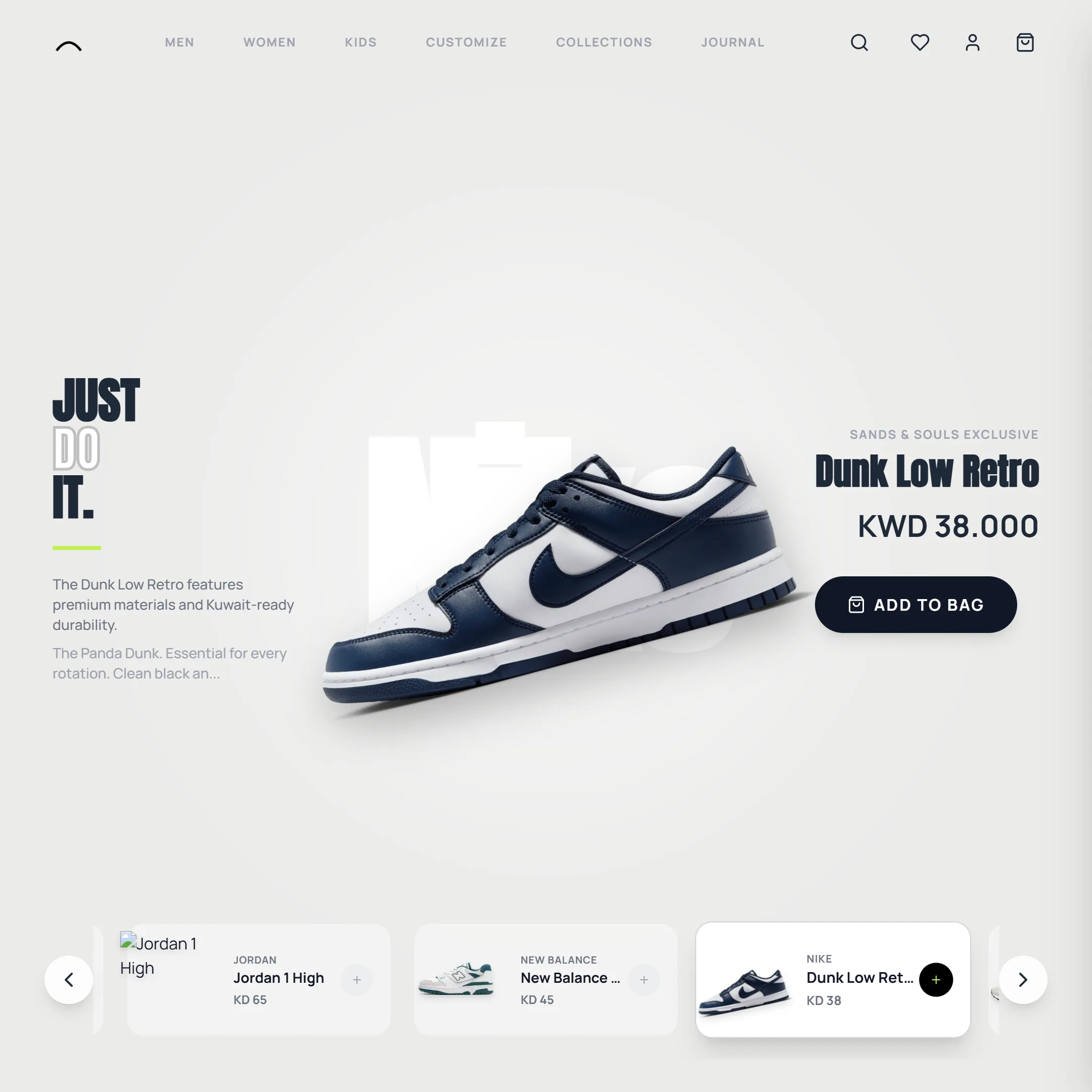
A pinned zigzag column of project cards that scroll up through the section, each scaling in as it arrives while the studio mark draws itself behind them.
Selected Work in Kuwait
Web design and web development Kuwait clients trust for motion-first, Awwwards-level sites — real projects, built and shipped by Kinematic Studio.
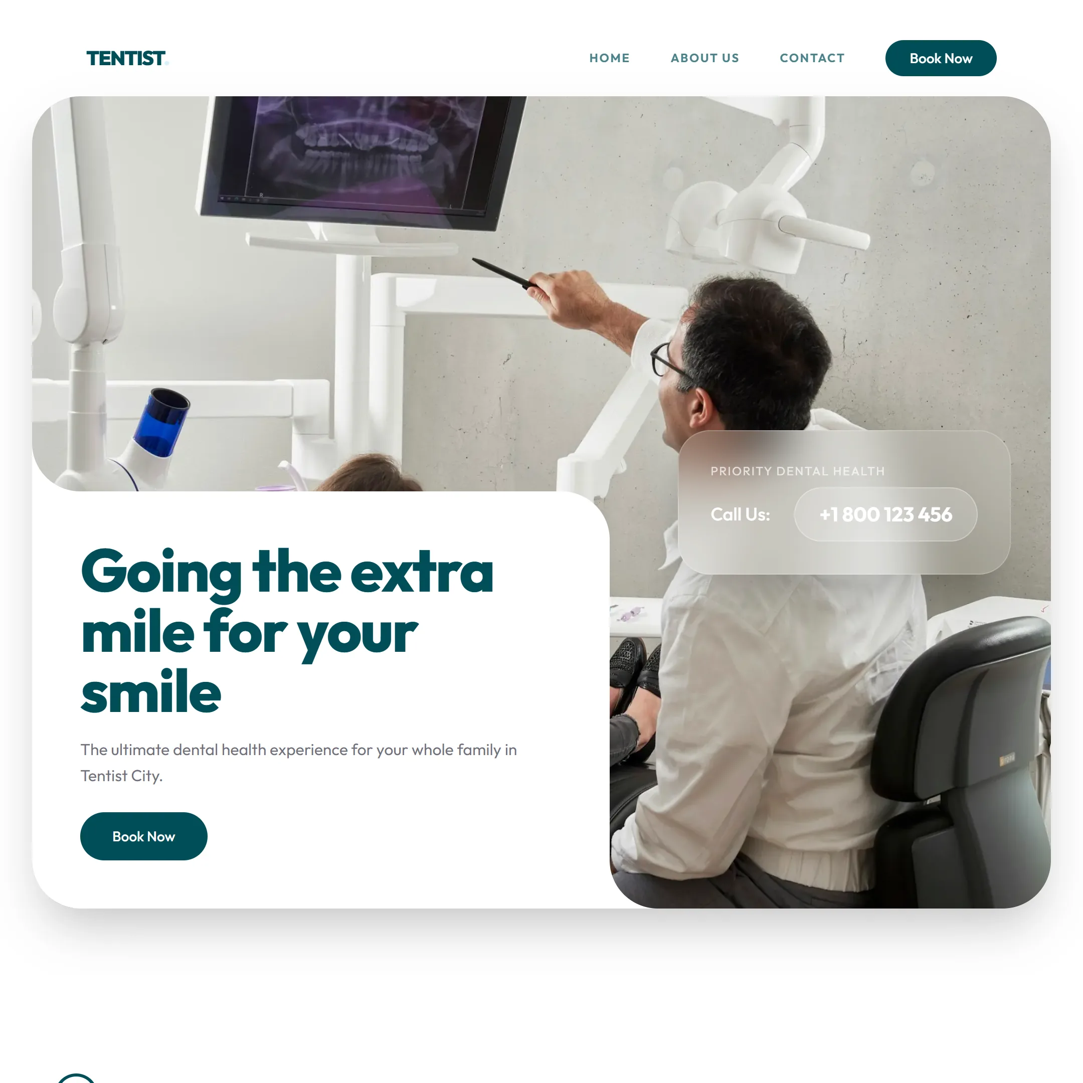
View All Projects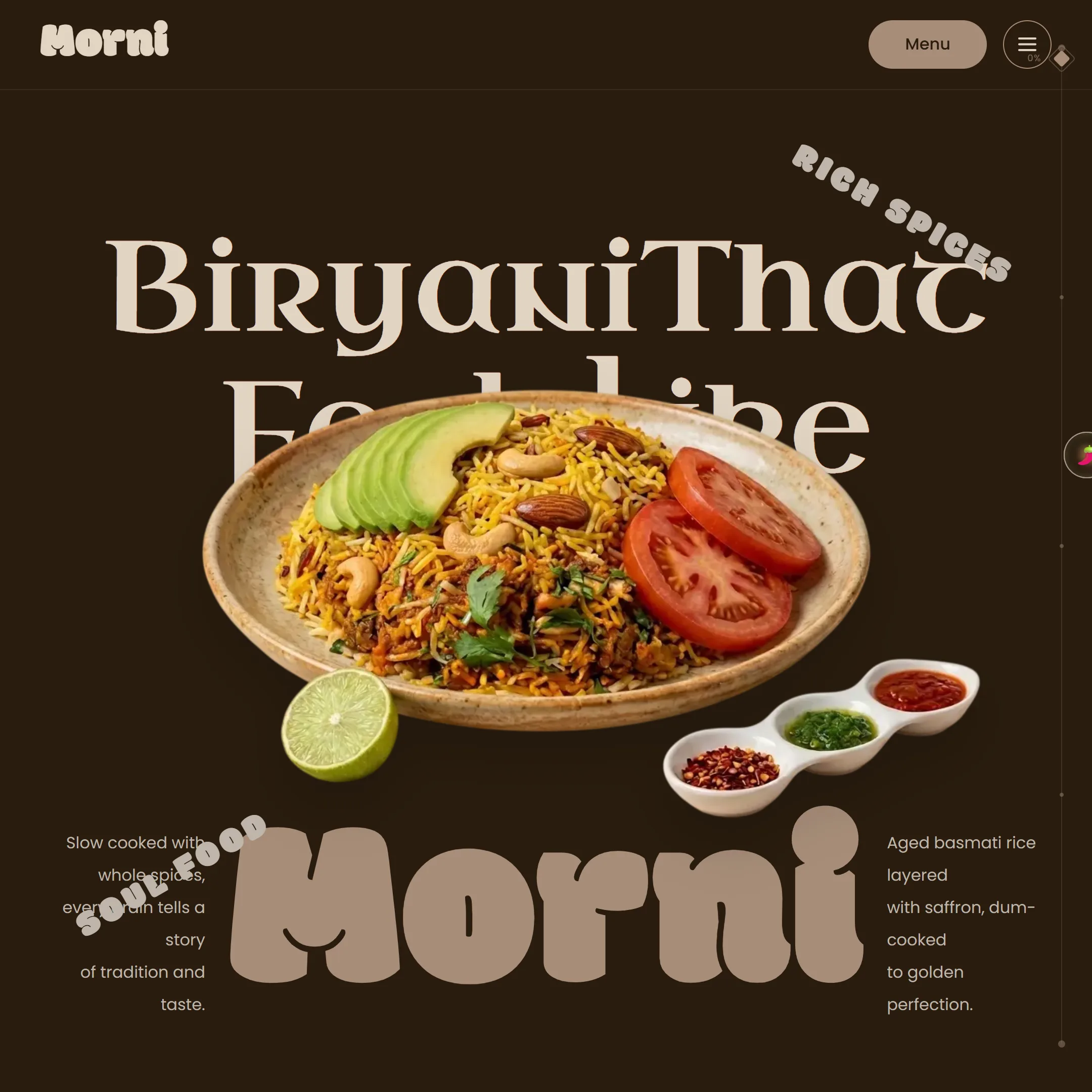

Open it in a new page for the pinned zigzag column that scales in as it scrolls
import WorkSection from "@/components/ui/work-section";

export default function WorkSectionDemo({ fullscreen }: { fullscreen?: boolean }) {
  if (fullscreen) return <WorkSection />;

  return (
    <div className="w-full min-w-0 space-y-3">
      {/* The pinned zigzag scroll needs the page's own scroll to play, so the
          card shows the static grid; open it in a new page for the pin. */}
      <div className="scrollbar-thin h-[560px] w-full overflow-y-auto rounded-card border border-line">
        <WorkSection pinned={false} />
      </div>
      <p className="text-center text-xs text-faint">
        Open it in a new page for the pinned zigzag column that scales in as it scrolls
      </p>
    </div>
  );
}
Installation
1. Install the dependencies.
terminal npm install gsap2. Add the
cnhelper, if you don't already have it.lib/utils.ts import { clsx, type ClassValue } from "clsx"; import { twMerge } from "tailwind-merge"; export function cn(...inputs: ClassValue[]) { return twMerge(clsx(inputs)); }3. Copy the component into your project.
components/ui/work-section.tsx 'use client' import { useEffect, useRef, useState } from 'react' import type { PointerEvent as ReactPointerEvent } from 'react' import gsap from 'gsap' import { PROJECTS } from '@/lib/kinematics-projects' import { onScroll } from '@/lib/on-scroll' import { usePrefersReducedMotion } from '@/lib/use-prefers-reduced-motion' import { useIsMobile } from '@/lib/use-is-mobile' // Square 1:1 project placeholder cards, alternating right/left, each one // stepping further down than the last — a zigzag column rather than a // single side stack. Below MIN_ZIGZAG_WIDTH (where two 420px columns plus // their gap and inset can no longer fit side by side), the layout collapses // to a single centered column instead — see useCardLayout below. const CARD_WIDTH_DESKTOP = 420 const TOP_OFFSET = 80 const CARD_COUNT = 6 // Vertical breathing room between a card and the next one directly below it // in the same sub-column (i and i+2 in zigzag mode). Cards alternate side, // so this only needs to clear same-side collisions, not immediate neighbors. const VERTICAL_GAP = 40 // Gap between the two sub-columns' facing edges (zigzag mode only). const COLUMN_GAP = 28 // Both sub-columns anchored to the section's right side — the "right" cards // sit RIGHT_INSET from the edge, the "left" cards sit directly to their // left (RIGHT_INSET + CARD_WIDTH + COLUMN_GAP from the edge), rather than // spanning the section's full width. Also the side margin budget used to // decide whether zigzag mode fits at all (see useCardLayout). const RIGHT_INSET_PCT = 8 // Below this viewport width, two real zigzag columns can't fit with any // breathing room — the layout falls back to one centered column instead. const MIN_ZIGZAG_WIDTH = 760 // Single-column mobile cards stay comfortably inset from both edges rather // than spanning edge-to-edge. const MOBILE_CARD_WIDTH_RATIO = 0.72 const MOBILE_CARD_MAX_WIDTH = 360 // The section header (h2 + paragraph + button, absolutely positioned at // top-24 left-8 — see the JSX below) sits ABOVE the card column in the same // pinned section. In zigzag mode the cards are anchored to the right side so // they never cross paths with it, but single-column mode centers every card // — including horizontally under the header's own footprint — so the first // card needs to start well below where that text block ends instead of // reusing the desktop TOP_OFFSET. const MOBILE_TOP_OFFSET = 420 /** Recomputes the card layout (size, step, column height, single- vs * two-column mode) from the current viewport width — zigzag's fixed 420px * two-column layout has no room to exist below ~760px, so narrow viewports * fall back to one centered column of smaller, viewport-relative cards. */ function computeCardLayout(viewportWidth: number) { const singleColumn = viewportWidth < MIN_ZIGZAG_WIDTH const cardWidth = singleColumn ? Math.min(MOBILE_CARD_MAX_WIDTH, viewportWidth * MOBILE_CARD_WIDTH_RATIO) : Math.min(CARD_WIDTH_DESKTOP, (viewportWidth * (1 - RIGHT_INSET_PCT / 100 - 0.04) - COLUMN_GAP) / 2) // Zigzag interleaves two sides, so same-side cards (i, i+2) only need to // clear half of card-height-plus-gap each step; single column stacks every // card sequentially, so it needs the full amount each step. const cardStep = singleColumn ? cardWidth + VERTICAL_GAP : Math.ceil((cardWidth + VERTICAL_GAP) / 2) const topOffset = singleColumn ? MOBILE_TOP_OFFSET : TOP_OFFSET const cards = Array.from({ length: CARD_COUNT }, (_, i) => ({ top: topOffset + i * cardStep, side: i % 2 === 0 ? ('right' as const) : ('left' as const), ...PROJECTS[i % PROJECTS.length], })) const columnHeight = topOffset + (CARD_COUNT - 1) * cardStep + cardWidth + TOP_OFFSET return { singleColumn, cardWidth, cardHeight: cardWidth, cards, columnHeight } } /** Re-derives the card layout on mount and on resize (e.g. orientation * change) — SSR/first-paint defaults to the desktop zigzag layout so there's * no hydration mismatch, then corrects on the client's first effect tick. */ function useCardLayout() { const [layout, setLayout] = useState(() => computeCardLayout(CARD_WIDTH_DESKTOP * 3)) useEffect(() => { const update = () => setLayout(computeCardLayout(window.innerWidth)) update() window.addEventListener('resize', update) return () => window.removeEventListener('resize', update) }, []) return layout } /** Oversized-wrapper + sticky-inner pin technique (same as hero/stack). The * section itself stays a fixed h-dvh for the whole pin — it never * scrolls away — while a zigzag column of portrait cards scrolls upward * inside it as the user keeps scrolling through the wrapper's extra * height. Progress is driven off the wrapper's position (read on every * scroll event, see lib/on-scroll) and applied as a direct * transform on the column to avoid re-rendering on every scroll tick. */ // Each card scales from 50% up to 100% as its own center rises from the // bottom of the viewport toward the middle — cards further down the column // (not yet "reached") sit at 50%, cards that have arrived sit at 100%, with // a smooth ramp in between rather than a hard cut. const SCALE_MIN = 0.5 const SCALE_MAX = 1 // Corner radius of the reveal square's clip-path — kept constant rather than // shrinking as it grows, so it still reads as a "rounded square" once it's // covered the card, not a hard-cornered rectangle. const REVEAL_RADIUS = 32 // public/images/Group.svg's three path shapes, flattened into one combined // path (their original nested-<g> transforms baked directly into the // coordinates) so a single stroke-dasharray/dashoffset can draw all three // as one continuous outline, in the original artwork's own 234x395 // viewBox space. const GROUP_PATH_D = 'M0,286.39L116.72,177.43L233.45,286.39L164.61,286.39L164.61,394.4L68.53,394.4L68.53,286.39L0,286.39Z ' + 'M0,103.66L0.02,159.51L116.52,55.26L233.01,159.35L233.45,102.8L116.52,0Z ' + 'M0,188.37L0.02,244.22L116.52,139.97L233.01,244.06L233.45,187.51L116.52,84.71Z' // Mobile only: how much scroll progress (0..1 of the section's whole pin) // the header text takes to fade out — small, so it reads as "gone after one // scroll" rather than a lingering fade. Left fully visible for the entire // pin on desktop/tablet (zigzag mode never crosses paths with it). const MOBILE_HEADER_FADE_RANGE = 0.05 type WorkSectionProps = { /** Pin the section and scroll the zigzag column through it as the page scrolls. Off, it renders the static grid it also uses on mobile — for placing it somewhere that is not the page's own scroll. */ pinned?: boolean } export default function WorkSection({ pinned = true }: WorkSectionProps) { const wrapperRef = useRef<HTMLDivElement>(null) const columnRef = useRef<HTMLDivElement>(null) const cardRefs = useRef<(HTMLAnchorElement | null)[]>([]) const groupFillPathRef = useRef<SVGPathElement>(null) const headerRef = useRef<HTMLDivElement>(null) const reducedMotion = usePrefersReducedMotion() const isMobile = useIsMobile() const { singleColumn, cardWidth, cardHeight, cards, columnHeight } = useCardLayout() // The hover reveal: a rounded square that grows outward from wherever the // cursor entered the card until it's guaranteed to cover the whole thing // (same grow-from-cursor clip-path technique as the hero's image reveal — // see playTransition in the Sketch Reveal Hero), then shrinks back to that same // point on pointer-leave. One clip-path proxy per card, keyed by index — // CARD_COUNT is fixed regardless of layout, so this never needs to resize. const revealRefs = useRef<(HTMLDivElement | null)[]>([]) const revealState = useRef(Array.from({ length: CARD_COUNT }, () => ({ x: 0, y: 0, half: 0 }))) const applyRevealClip = (i: number) => { const reveal = revealRefs.current[i] const state = revealState.current[i] if (!reveal || !state) return const { x, y, half } = state reveal.style.clipPath = `inset(${y - half}px ${cardWidth - x - half}px ${cardHeight - y - half}px ${x - half}px round ${REVEAL_RADIUS}px)` } // Local coordinates are computed in the card's own unscaled box — // dividing out rect.width/cardWidth undoes the scroll-driven scale // transform (SCALE_MIN..SCALE_MAX) so the clip-path math stays correct // regardless of how small the card currently appears on screen. const handleCardPointerEnter = (i: number, e: ReactPointerEvent<HTMLAnchorElement>) => { const card = cardRefs.current[i] const state = revealState.current[i] if (!card || !state) return const rect = card.getBoundingClientRect() const scale = rect.width / cardWidth const x = (e.clientX - rect.left) / scale const y = (e.clientY - rect.top) / scale state.x = x state.y = y state.half = 0 applyRevealClip(i) const maxHalf = Math.max(x, cardWidth - x, y, cardHeight - y, 0) gsap.killTweensOf(state) gsap.to(state, { half: maxHalf, duration: 0.55, ease: 'power3.out', onUpdate: () => applyRevealClip(i) }) } const handleCardPointerLeave = (i: number) => { const state = revealState.current[i] if (!state) return gsap.killTweensOf(state) gsap.to(state, { half: 0, duration: 0.3, ease: 'power2.in', onUpdate: () => applyRevealClip(i) }) } useEffect(() => { const wrapper = wrapperRef.current const column = columnRef.current const groupFillPath = groupFillPathRef.current if (!wrapper || !column || !pinned) return // Border-fill draw length only needs computing once — the path itself // never changes shape. const groupTotal = groupFillPath?.getTotalLength() ?? 0 if (groupFillPath) { groupFillPath.style.strokeDasharray = `${groupTotal}` groupFillPath.style.strokeDashoffset = `${groupTotal}` } const updateScrub = () => { const rect = wrapper.getBoundingClientRect() const extraScroll = wrapper.offsetHeight - window.innerHeight const progress = extraScroll > 0 ? Math.min(1, Math.max(0, -rect.top / extraScroll)) : 0 // How far the column can travel before its bottom edge reaches the // viewport's bottom edge — no further, so it doesn't overshoot. const travel = Math.max(0, columnHeight - window.innerHeight) column.style.transform = `translateY(${-progress * travel}px)` // Mobile only: the header text sits centered above the (now // single-column, centered) card stack, so it's only ever meant to // greet the section — the first bit of scroll clears it out of the // way instead of leaving it hovering over the cards scrolling past // underneath it. if (headerRef.current) { headerRef.current.style.opacity = singleColumn ? String(Math.max(0, 1 - progress / MOBILE_HEADER_FADE_RANGE)) : '1' } // The background Group.svg's outline fills in step with the same // overall section scroll progress used to move the column. if (groupFillPath) { groupFillPath.style.strokeDashoffset = `${groupTotal * (1 - progress)}` } const viewportH = window.innerHeight cardRefs.current.forEach((card) => { if (!card) return const cardRect = card.getBoundingClientRect() const centerY = cardRect.top + cardRect.height / 2 // 0 while the card's center is still at/below the viewport's // bottom edge, ramping up to 1 by the time it reaches the middle // of the viewport, then holding at 1 as it continues past. const arrival = Math.min(1, Math.max(0, (viewportH - centerY) / (viewportH * 0.5))) const scale = SCALE_MIN + (SCALE_MAX - SCALE_MIN) * arrival card.style.transform = `scale(${scale})` }) } updateScrub() return onScroll(updateScrub) // Re-subscribes whenever the layout (card size/columnHeight) changes — // e.g. on resize/orientation change — so this scrub always reads the // current columnHeight rather than one captured stale in closure. }, [columnHeight, pinned, reducedMotion, isMobile]) // Reduced motion: the pinned zigzag column only reveals cards 2-6 by // scroll-jacking the page through a wrapper several screens taller than // the section itself — collapsing that pin range to a normal h-dvh // (the way HeroSection/StackSection do) would strand every card past the // first one behind overflow-hidden, permanently unreachable, instead of // just removing the animation. So this renders a genuinely different, // static layout instead: the same header and cards in a plain responsive // grid, normal document flow, no pin/scroll-jack/scale-ramp — every // project reachable by ordinary scrolling. // Mobile gets the same plain, static grid as reduced-motion — no pin/ // scroll-jack, no scale-ramp, every project reachable by ordinary // scrolling (see the reducedMotion note above for why the pin can't just // collapse to a normal h-dvh instead of swapping layouts entirely). if (reducedMotion || isMobile || !pinned) { return ( <section className="bg-[#0f1113] px-6 py-24 md:px-12 md:py-32"> <div className="mx-auto flex max-w-6xl flex-col gap-12"> <div className="flex flex-col items-start gap-5"> <h2 className="font-kine-display text-3xl uppercase tracking-tight text-white md:text-5xl"> Selected Work in Kuwait </h2> <p className="max-w-md font-kine-body text-sm text-white/60 md:text-base"> Web design and web development Kuwait clients trust for motion-first, Awwwards-level sites — real projects, built and shipped by Kinematic Studio. </p> <a href="/work" className="group relative overflow-hidden rounded-full border border-white px-6 py-3 font-sans text-xs font-bold uppercase tracking-widest text-white transition-colors duration-300 hover:text-kine-bg" > <span className="absolute inset-0 -translate-x-full bg-white transition-transform duration-300 ease-out group-hover:translate-x-0" /> <span className="relative">View All Projects</span> </a> </div> {/* Mobile stays a single column at every width below md — the sm: 2-column switch (640px) kicked in earlier than isMobile's own 768px cutoff, and with CARD_COUNT possibly leaving a lone card on the last row, that card sat flush left instead of centered by itself. Reduced-motion desktop/tablet users keep the original 2/3-column layout. */} <div className={isMobile ? 'grid grid-cols-1 gap-8' : 'grid grid-cols-1 gap-8 sm:grid-cols-2 lg:grid-cols-3'}> {cards.map((card, i) => ( <a key={i} href={card.slug ? `/work/${card.slug}` : '/work'} aria-label={`View ${card.name} case study`} className="group relative block aspect-square overflow-hidden rounded-2xl border border-[#2b2e34] bg-[#16181b]" > <div className="absolute inset-[2.5%] overflow-hidden rounded-lg"> <img src={card.image} alt={`${card.name} project artwork — web design Kuwait`} className="absolute inset-0 size-full object-cover" /> </div> <div className="pointer-events-none absolute inset-0 z-10 flex flex-col justify-between bg-black/50 p-6 opacity-0 transition-opacity duration-300 ease-out group-hover:opacity-100"> <span className="font-sans text-xs font-bold uppercase tracking-widest text-kine-primary"> {card.category} </span> <div className="flex items-center justify-between gap-4"> <span className="font-kine-display text-2xl text-kine-accent">{card.name}</span> <span className="shrink-0 rounded-full border border-kine-primary px-4 py-2 font-sans text-xs font-bold uppercase tracking-widest text-kine-primary transition-colors duration-300 group-hover:bg-kine-primary group-hover:text-kine-bg"> View </span> </div> </div> </a> ))} </div> </div> </section> ) } return ( <div ref={wrapperRef} className="relative h-[300vh] w-full"> <section className="sticky top-0 h-dvh w-full overflow-hidden" style={{ backgroundColor: '#0f1113' }} > {/* Group.svg as a large, near-invisible background silhouette, with its own outline drawn in on top of it (brand green, stroke-dasharray/dashoffset) as the section is scrolled through — the same scroll-driven "line draw" technique used elsewhere in this app. */} <svg className="pointer-events-none absolute inset-0 z-0 h-full w-full" viewBox="0 0 234 395" preserveAspectRatio="xMidYMid meet" > <path d={GROUP_PATH_D} fill="none" stroke="#ffffff" strokeOpacity={0.05} strokeWidth={2} /> <path ref={groupFillPathRef} d={GROUP_PATH_D} fill="none" stroke="#ceff00" strokeWidth={2} strokeLinecap="round" strokeLinejoin="round" /> </svg> {/* Section header — sits directly in the sticky-pinned section itself (not inside the scrolling card column below), so it stays fixed at the top-left of the screen for the entire pin duration and only scrolls away once the section itself unpins. Offset below top-24/28 to clear the site's own fixed Header (~64-96px tall, z-[100] — see components/Header.tsx) rather than sitting underneath it. */} <div ref={headerRef} className="absolute left-8 top-24 z-20 flex flex-col items-start gap-5 transition-opacity duration-300 ease-out md:left-12 md:top-28" > <h2 className="font-kine-display text-3xl uppercase tracking-tight text-white md:text-5xl"> Selected Work in Kuwait </h2> <p className="max-w-md font-kine-body text-sm text-white/60 md:text-base"> Web design and web development Kuwait clients trust for motion-first, Awwwards-level sites — real projects, built and shipped by Kinematic Studio. </p> <a href="/work" className="group relative overflow-hidden rounded-full border border-white px-6 py-3 font-sans text-xs font-bold uppercase tracking-widest text-white transition-colors duration-300 hover:text-kine-bg" > <span className="absolute inset-0 -translate-x-full bg-white transition-transform duration-300 ease-out group-hover:translate-x-0" /> <span className="relative">View All Projects</span> </a> </div> <div className="relative z-10 h-dvh w-full overflow-hidden"> <div ref={columnRef} className="absolute inset-x-0 top-0" style={{ height: columnHeight }}> {cards.map((card, i) => ( <a key={i} href={card.slug ? `/work/${card.slug}` : '/work'} aria-label={`View ${card.name} case study`} ref={(el) => { cardRefs.current[i] = el }} onPointerEnter={(e) => handleCardPointerEnter(i, e)} onPointerLeave={() => handleCardPointerLeave(i)} className="group absolute block shrink-0 cursor-pointer overflow-hidden rounded-2xl border border-[#2b2e34] bg-[#16181b]" style={{ width: cardWidth, height: cardHeight, top: card.top, // Single-column (mobile): every card centered horizontally. // Zigzag (desktop/tablet): both sub-columns anchored to the // section's right side — "right" cards sit RIGHT_INSET_PCT // from the edge, "left" cards sit directly to their left. ...(singleColumn ? { left: `calc(50% - ${cardWidth / 2}px)` } : { right: card.side === 'right' ? `${RIGHT_INSET_PCT}%` : `calc(${RIGHT_INSET_PCT}% + ${cardWidth + COLUMN_GAP}px)`, }), transformOrigin: 'center center', transform: `scale(${SCALE_MIN})`, }} > {/* Main card artwork — inset 2.5% on every side (95% of the card's width/height), always visible. */} <div className="absolute inset-[2.5%] overflow-hidden rounded-lg"> <img src={card.image} alt={`${card.name} project artwork — web design Kuwait`} className="absolute inset-0 size-full object-cover" /> </div> {/* Hover reveal — a rounded square clipped to nothing at rest, grown from the cursor's entry point to fully cover the card (see handleCardPointerEnter), swapping the main artwork above for the project's in-context laptop shot. */} <div ref={(el) => { revealRefs.current[i] = el }} className="pointer-events-none absolute inset-0" style={{ clipPath: 'inset(50% 50% 50% 50%)' }} > <img src={card.laptopImage} alt={`${card.name} project shown on laptop — web design Kuwait`} className="absolute inset-0 size-full object-cover" /> </div> {/* Category / name / CTA — hidden until hover, then fades in over a dark scrim so the text stays readable against whatever project image eventually fills the card. */} <div className="pointer-events-none absolute inset-0 z-10 flex flex-col justify-between bg-black/50 p-6 opacity-0 transition-opacity duration-300 ease-out group-hover:opacity-100"> <span className="font-sans text-xs font-bold uppercase tracking-widest text-kine-primary"> {card.category} </span> <div className="flex items-center justify-between gap-4"> <span className="font-kine-display text-2xl text-kine-accent">{card.name}</span> <span className="shrink-0 rounded-full border border-kine-primary px-4 py-2 font-sans text-xs font-bold uppercase tracking-widest text-kine-primary transition-colors duration-300 group-hover:bg-kine-primary group-hover:text-kine-bg"> View </span> </div> </div> </a> ))} </div> </div> </section> </div> ) }lib/kinematics-projects.ts export interface Project { id: string name: string category: 'Web Design' | 'Web Development' | 'SaaS' | 'Ecommerce' image: string laptopImage: string slug?: string featured?: boolean // Case study content (/work/[slug]) tagline?: string year?: string services?: string[] techStack?: string[] challenge?: string solution?: string seoDescription?: string } // All projects available for display export const PROJECTS: Project[] = [ { id: '1', name: 'Morni', category: 'Web Design', image: '/kine/work-images/morni-web-design-kuwait-case-study.webp', laptopImage: '/kine/work-images/laptop/morni-laptop-mockup-web-design-kuwait.webp', slug: 'morni', featured: true, tagline: 'A slow-cooked brand story for a Kuwaiti kitchen', year: '2025', services: ['Art Direction', 'Web Design', 'Motion Design'], techStack: ['Next.js', 'GSAP', 'Lenis', 'Tailwind CSS'], challenge: 'Morni needed a digital presence as rich as its saffron-layered dishes — but food sites in the region default to static menus and stock photography. The brand wanted visitors to feel the warmth of the kitchen before reading a single word.', solution: 'We built a scroll-driven narrative where dishes assemble as you move, paired with typography inspired by hand-lettered Arabic menus. Every animation runs at 60fps, and the full experience loads in under a second on Kuwait mobile networks.', seoDescription: 'Morni case study — web design Kuwait project by Kinematic Studio. A scroll-driven brand site for a Kuwaiti kitchen, built with Next.js and GSAP at 60fps.', }, { id: '2', name: 'Dreamsoftplay', category: 'Web Development', image: '/kine/work-images/dreamsoftplay-web-development-kuwait-case-study.webp', laptopImage: '/kine/work-images/laptop/dreamsoftplay-laptop-mockup-web-development-kuwait.webp', slug: 'dreamsoftplay', featured: true, tagline: 'Minimal interiors, maximal interaction', year: '2025', services: ['Web Development', 'Interaction Design', 'Performance'], techStack: ['Next.js', 'Framer Motion', 'Lenis', 'Tailwind CSS'], challenge: 'An interior design studio selling minimalism needed a site that practiced what it preached — restrained, airy layouts that still felt alive. Most furniture sites bury their photography under cluttered UI and slow page loads.', solution: 'We let the photography lead: full-bleed room scenes with parallax depth, product reveals timed to scroll, and a navigation that stays invisible until needed. The result is a site that feels like walking through a showroom.', seoDescription: 'Dreamsoftplay case study — web development Kuwait project by Kinematic Studio. A minimal, motion-first interior design site built with Next.js and Framer Motion.', }, { id: '3', name: 'NexusOS', category: 'SaaS', image: '/kine/work-images/nexusos-saas-web-design-kuwait.webp', laptopImage: '/kine/work-images/laptop/nexusos-laptop-mockup-saas-kuwait.webp', slug: 'nexusos', tagline: 'Running schools at the speed of AI', year: '2024', services: ['Product Design', 'Web Development', 'SaaS Platform'], techStack: ['Next.js', 'TypeScript', 'PostgreSQL', 'Tailwind CSS'], challenge: 'NexusOS is an all-in-one education operating system — assignments, results, and circulars across multi-tenant institutions. The marketing site had to explain a complex platform in seconds while looking nothing like typical enterprise software.', solution: 'We designed a landing experience that demos the product as you scroll: live-looking dashboards animate into view, feature cards respond to the cursor, and the copy is ruthlessly compressed. Sign-up conversion became the only metric that mattered.', seoDescription: 'NexusOS case study — Next.js agency Kuwait project by Kinematic Studio. A SaaS marketing site for an AI-powered education platform with animated product demos.', }, { id: '4', name: 'Sands & Souls', category: 'Ecommerce', image: '/kine/work-images/sands-souls-ecommerce-web-design-kuwait.webp', laptopImage: '/kine/work-images/laptop/sands-souls-laptop-mockup-ecommerce-kuwait.webp', slug: 'sands-souls', tagline: 'Sneaker culture, Kuwait edition', year: '2024', services: ['Ecommerce Design', 'Web Development', 'Brand Motion'], techStack: ['Next.js', 'GSAP', 'Stripe', 'Tailwind CSS'], challenge: 'A streetwear retailer competing with global sneaker platforms needed a store that felt like a drop, not a catalog. Local ecommerce in Kuwait means fighting slow checkouts, generic templates, and zero brand energy.', solution: 'We built product pages with oversized typography and kinetic hover states, a cart that never interrupts browsing, and a checkout tuned for KWD payments. The store loads instantly and feels like the culture it sells.', seoDescription: 'Sands & Souls case study — ecommerce web design Kuwait project by Kinematic Studio. A kinetic sneaker store built with Next.js, GSAP, and Stripe.', }, { id: '5', name: 'Tentist', category: 'Web Design', image: '/kine/work-images/tentist-web-design-kuwait-case-study.webp', laptopImage: '/kine/work-images/laptop/tentist-laptop-mockup-web-design-kuwait.webp', slug: 'tentist', tagline: 'Desert camping, designed for the web', year: '2024', services: ['Web Design', 'Motion Design', 'Booking UX'], techStack: ['Next.js', 'GSAP', 'Lenis', 'Tailwind CSS'], challenge: 'Tentist books luxury desert camps — an experience business stuck with a brochure website. Photos of dunes at golden hour deserved more than a static grid, and the booking flow lost customers at every step.', solution: 'We rebuilt the site around immersion: horizon-wide hero imagery, scroll-triggered transitions that mimic moving through the desert, and a booking flow cut to three steps. The site now sells the feeling before the reservation.', seoDescription: 'Tentist case study — interactive web design Kuwait project by Kinematic Studio. An immersive desert camping booking site with scroll-driven transitions.', }, { id: '6', name: 'Orbitcorp', category: 'Web Design', image: '/kine/work-images/orbitcorp-web-design-kuwait-case-study.webp', laptopImage: '/kine/work-images/laptop/orbitcorp-laptop-mockup-web-design-kuwait.webp', slug: 'orbitcorp', tagline: 'A corporate site that escaped orbit', year: '2023', services: ['Web Design', 'Brand Identity', 'Development'], techStack: ['Next.js', 'Framer Motion', 'Tailwind CSS'], challenge: 'Orbitcorp wanted to shed the beige corporate template — dense text blocks, stocky headshots, dated sliders — without losing the credibility a B2B audience expects. Bold, but never unserious.', solution: 'We paired a restrained grid with confident motion: sections that settle into place, numbers that count up on arrival, and a dark palette that photographs well in pitch decks. Corporate, finally with a pulse.', seoDescription: 'Orbitcorp case study — website designers in Kuwait project by Kinematic Studio. A modern B2B corporate site with confident motion built on Next.js.', }, ] /** Look up a project by its slug; returns undefined for unknown slugs. */ export function getProjectBySlug(slug: string): Project | undefined { return PROJECTS.find((p) => p.slug === slug) } /** The project after this one in PROJECTS order, wrapping around — for "next project" previews. */ export function getNextProject(slug: string): Project { const index = PROJECTS.findIndex((p) => p.slug === slug) return PROJECTS[(index + 1) % PROJECTS.length] } export const CATEGORIES = ['All', ...new Set(PROJECTS.map((p) => p.category))]lib/on-scroll.ts /** * Calls `handler` whenever anything scrolls — the window or any scroll * container on the page — and on resize. Returns the unsubscribe. * * The Kinematics components were written against a Lenis instance's scroll * event. They only ever use it as a tick and measure themselves with * getBoundingClientRect, so any scroll will do. Listening in the capture * phase catches scroll events from every element, since they do not bubble: * the same component works pinned to the page or inside a scrolling card. */ export function onScroll(handler: () => void) { const options = { capture: true, passive: true } as const; window.addEventListener("scroll", handler, options); window.addEventListener("resize", handler); return () => { window.removeEventListener("scroll", handler, options); window.removeEventListener("resize", handler); }; }lib/use-is-mobile.ts "use client"; import { useEffect, useState } from "react"; const QUERY = "(max-width: 767px)"; /** True below Tailwind's `md` breakpoint (767px). Starts `false` on the * server/first paint (no `matchMedia` there) and corrects on mount — the * same convention as usePrefersReducedMotion. For components that render a * genuinely different layout on mobile, not just a slowed-down one. */ export function useIsMobile() { const [isMobile, setIsMobile] = useState(false); useEffect(() => { const query = window.matchMedia(QUERY); setIsMobile(query.matches); const handleChange = (e: MediaQueryListEvent) => setIsMobile(e.matches); query.addEventListener("change", handleChange); return () => query.removeEventListener("change", handleChange); }, []); return isMobile; }lib/use-prefers-reduced-motion.ts 'use client' import { useEffect, useState } from 'react' // TEMPORARILY DISABLED — hardcoded to false, ignoring the real system // preference. On Windows, turning off "Show animations in Windows" // (Settings > Accessibility > Visual effects) makes matchMedia report // prefers-reduced-motion: reduce in every browser, even for people who // never touched a "reduce motion" toggle specifically — that's what made // every pinned section on this site go static at once. Disabled here // (rather than ripping out every call site) until there's a deliberate // decision on how/whether to bring this back — e.g. gated behind an // explicit in-app toggle instead of trusting the OS signal outright. const FORCE_DISABLED = true /** True when the user has requested reduced motion at the OS/browser level. * Every scroll-jacked "pin" section in this app (hero shrink, StackSection, * WorkSection, VisualCode, the /work and /services process sections, etc.) * checks this to skip its oversized-scroll-wrapper + sticky-pin mechanic * entirely — rather than just slowing the same motion down — so those users * get a normal, statically-visible page instead of being carried through a * long (sometimes 1000+vh) scroll-jacked, parallaxing, zooming sequence. * Starts `false` on the server/first paint (no media-query access there) and * corrects on mount — matches this codebase's existing convention of * reading `window`-only facts inside an effect rather than during render. */ export function usePrefersReducedMotion() { const [reduced, setReduced] = useState(false) useEffect(() => { if (FORCE_DISABLED) return const query = window.matchMedia('(prefers-reduced-motion: reduce)') setReduced(query.matches) const handleChange = (e: MediaQueryListEvent) => setReduced(e.matches) query.addEventListener('change', handleChange) return () => query.removeEventListener('change', handleChange) }, []) return FORCE_DISABLED ? false : reduced }styles/kinematics.css /* Kinematic Studio's palette and type, for the components ported from its site. Namespaced as kine-* so they sit beside this library's own tokens — Kinematics calls its off-white "accent", which here is already the blue. Import this from the stylesheet that imports Tailwind, so the @theme block turns into utilities: bg-kine-bg, text-kine-primary/70, font-kine-display and so on. */ @theme { --color-kine-bg: #0f1113; --color-kine-primary: #ceff00; --color-kine-surface: #2b2e34; --color-kine-accent: #e2e8f0; /* Audiowide for headlines, Geo for body copy. Geo breaks up at small sizes, so tiny labels use the plain sans instead. */ --font-kine-display: "Audiowide", ui-sans-serif, system-ui, sans-serif; --font-kine-body: "Geo", ui-sans-serif, system-ui, sans-serif; /* Morni, the restaurant client in the Emoji Cursor demo. */ --font-morni-brand: "Modak", ui-sans-serif, system-ui, sans-serif; --font-morni-body: "Poppins", ui-sans-serif, system-ui, sans-serif; } /* Manifesto emoji markers — the box grows from square to rectangle as scroll reaches it; once mostly grown, the emoji starts rolling, paused until then via animation-play-state set inline. */ @keyframes manifesto-emoji-roll { to { transform: rotate(360deg); } } /* Expertise cards — small, always-looping visuals tying each card's animation to its own subject (motion, layout, load speed, ranking, language). CSS keyframes rather than GSAP, since they run for as long as the card is mounted. */ @keyframes expertise-dash { to { stroke-dashoffset: -24; } } .expertise-flow-line { stroke-dasharray: 6 6; animation: expertise-dash 1s linear infinite; } @keyframes expertise-block-a { 0%, 100% { width: 85%; } 50% { width: 45%; } } @keyframes expertise-block-b { 0%, 100% { width: 55%; } 50% { width: 90%; } } @keyframes expertise-block-c { 0%, 100% { width: 70%; } 50% { width: 30%; } } .expertise-block-a { animation: expertise-block-a 3.2s ease-in-out infinite; } .expertise-block-b { animation: expertise-block-b 3.2s ease-in-out infinite 0.3s; } .expertise-block-c { animation: expertise-block-c 3.2s ease-in-out infinite 0.6s; } @keyframes expertise-fill { 0% { width: 6%; opacity: 0.5; } 70% { width: 100%; opacity: 1; } 85% { width: 100%; opacity: 1; } 100% { width: 6%; opacity: 0.5; } } .expertise-fill-bar { animation: expertise-fill 2.2s cubic-bezier(0.65, 0, 0.35, 1) infinite; } @keyframes expertise-rank-bar-1 { 0%, 100% { height: 30%; } 50% { height: 80%; } } @keyframes expertise-rank-bar-2 { 0%, 100% { height: 55%; } 50% { height: 25%; } } @keyframes expertise-rank-bar-3 { 0%, 100% { height: 40%; } 50% { height: 95%; } } @keyframes expertise-rank-bar-4 { 0%, 100% { height: 70%; } 50% { height: 50%; } } .expertise-rank-1 { animation: expertise-rank-bar-1 2.4s ease-in-out infinite; } .expertise-rank-2 { animation: expertise-rank-bar-2 2.4s ease-in-out infinite 0.15s; } .expertise-rank-3 { animation: expertise-rank-bar-3 2.4s ease-in-out infinite 0.3s; } .expertise-rank-4 { animation: expertise-rank-bar-4 2.4s ease-in-out infinite 0.45s; } @keyframes expertise-lang-cross { 0%, 45% { opacity: 1; transform: translateY(0); } 50%, 95% { opacity: 0; transform: translateY(-6px); } 100% { opacity: 1; transform: translateY(0); } } @keyframes expertise-lang-cross-alt { 0%, 45% { opacity: 0; transform: translateY(6px); } 50%, 95% { opacity: 1; transform: translateY(0); } 100% { opacity: 0; transform: translateY(6px); } } .expertise-lang-a { animation: expertise-lang-cross 3.6s ease-in-out infinite; } .expertise-lang-b { animation: expertise-lang-cross-alt 3.6s ease-in-out infinite; }
Props
| Prop | Type | Default | Description |
|---|---|---|---|
| pinned | boolean | true | Pin and scroll the column. Off, it renders the static grid it also uses on mobile. |