Navigation
Filter Tabs
Category tabs with a green underline that glides to whichever one is active.
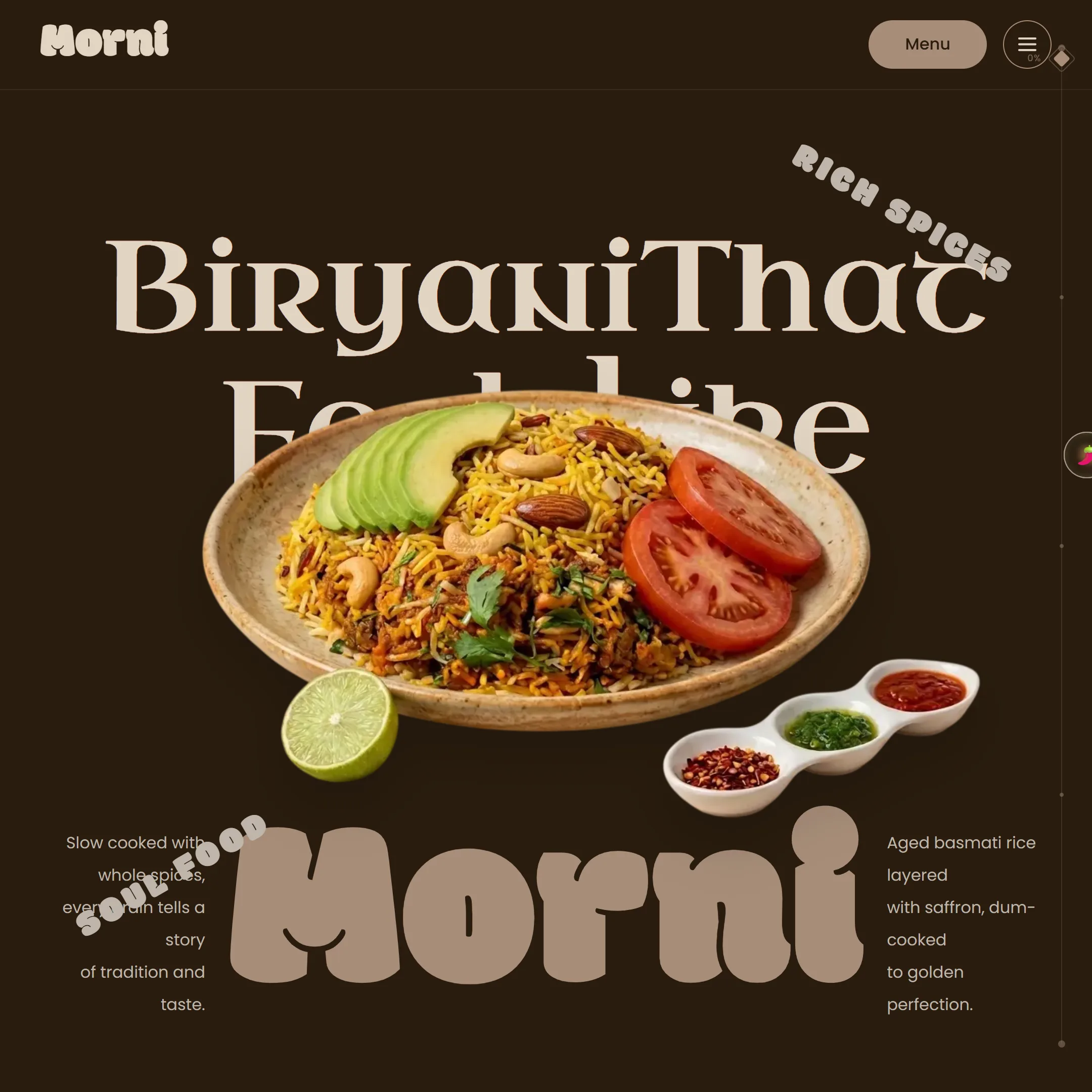
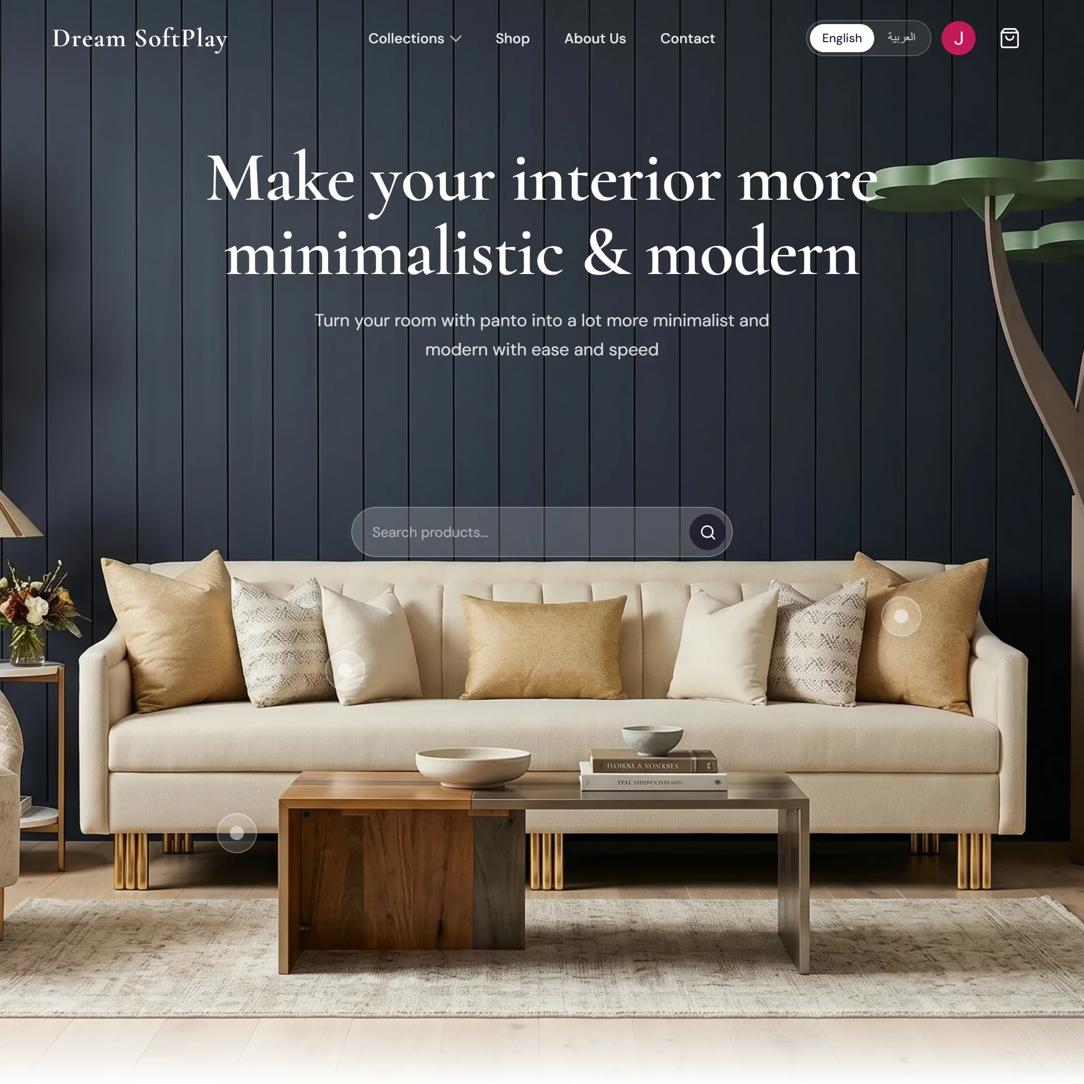
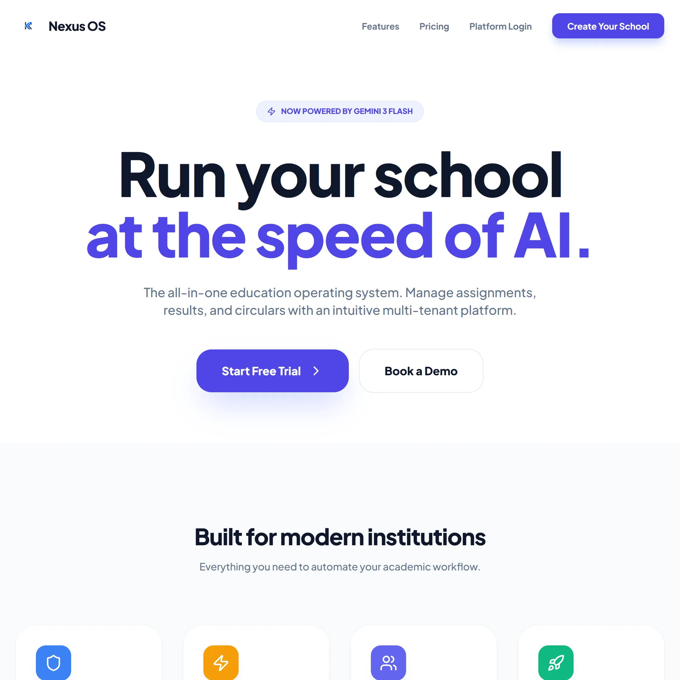
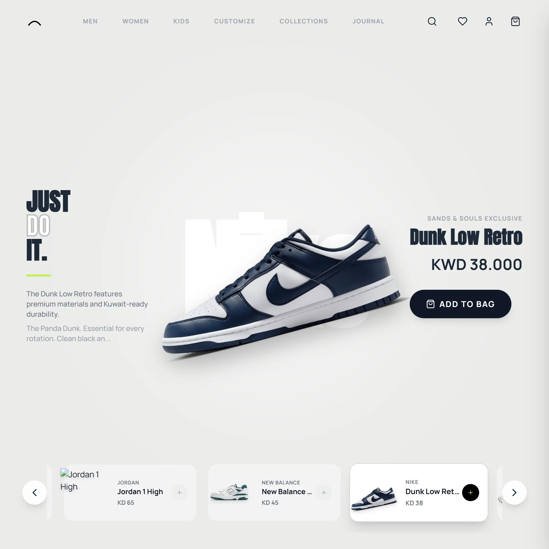
import { useState } from "react";
import FilterTabs from "@/components/ui/filter-tabs";
import { CATEGORIES, PROJECTS } from "@/lib/kinematics-projects";

export default function FilterTabsDemo() {
  const [active, setActive] = useState("All");
  const shown = PROJECTS.filter((project) => active === "All" || project.category === active);

  return (
    <div className="w-full min-w-0 space-y-6 rounded-card border border-line bg-kine-bg p-6 md:p-10">
      <div className="overflow-x-auto">
        <FilterTabs categories={CATEGORIES} activeCategory={active} onCategoryChange={setActive} />
      </div>
      <div className="grid grid-cols-2 gap-4 sm:grid-cols-3">
        {shown.map((project) => (
          <figure key={project.id} className="space-y-2">
            <img
              src={project.image}
              alt={project.name}
              className="aspect-square w-full rounded-lg object-cover"
            />
            <figcaption className="font-kine-body text-sm text-kine-accent/70">{project.name}</figcaption>
          </figure>
        ))}
      </div>
    </div>
  );
}Installation
1. Install the dependencies.
terminal npm install gsap2. Add the
cnhelper, if you don't already have it.lib/utils.ts import { clsx, type ClassValue } from "clsx"; import { twMerge } from "tailwind-merge"; export function cn(...inputs: ClassValue[]) { return twMerge(clsx(inputs)); }3. Copy the component into your project.
components/ui/filter-tabs.tsx 'use client' import { useEffect, useRef } from 'react' import gsap from 'gsap' interface FilterTabsProps { categories: string[] activeCategory: string onCategoryChange: (category: string) => void } export default function FilterTabs({ categories, activeCategory, onCategoryChange }: FilterTabsProps) { const tabsRef = useRef<HTMLDivElement>(null) const underlineRef = useRef<HTMLDivElement>(null) const tabButtonsRef = useRef<(HTMLButtonElement | null)[]>([]) useEffect(() => { const updateUnderline = () => { const activeButton = tabButtonsRef.current.find( (btn) => btn?.textContent?.toUpperCase() === activeCategory.toUpperCase() ) if (!activeButton || !underlineRef.current) return const rect = activeButton.getBoundingClientRect() const parentRect = tabsRef.current?.getBoundingClientRect() if (!parentRect) return const left = rect.left - parentRect.left const width = rect.width gsap.to(underlineRef.current, { width, left, duration: 0.4, ease: 'power3.out', }) } updateUnderline() window.addEventListener('resize', updateUnderline) return () => window.removeEventListener('resize', updateUnderline) }, [activeCategory]) return ( <div ref={tabsRef} className="relative flex items-center gap-6 md:gap-8 border-b border-white/10"> {categories.map((category, i) => ( <button key={category} ref={(el) => { tabButtonsRef.current[i] = el }} onClick={() => onCategoryChange(category)} className={`relative pb-4 font-kine-body text-sm font-bold uppercase tracking-widest transition-colors duration-300 md:text-base ${ activeCategory === category ? 'text-kine-primary' : 'text-kine-accent/60 hover:text-kine-accent' }`} > {category} </button> ))} {/* Animated underline — positioned absolutely under the active tab, animated via GSAP on category change. */} <div ref={underlineRef} className="absolute bottom-0 h-1 bg-kine-primary" style={{ left: 0, width: 0 }} /> </div> ) }styles/kinematics.css /* Kinematic Studio's palette and type, for the components ported from its site. Namespaced as kine-* so they sit beside this library's own tokens — Kinematics calls its off-white "accent", which here is already the blue. Import this from the stylesheet that imports Tailwind, so the @theme block turns into utilities: bg-kine-bg, text-kine-primary/70, font-kine-display and so on. */ @theme { --color-kine-bg: #0f1113; --color-kine-primary: #ceff00; --color-kine-surface: #2b2e34; --color-kine-accent: #e2e8f0; /* Audiowide for headlines, Geo for body copy. Geo breaks up at small sizes, so tiny labels use the plain sans instead. */ --font-kine-display: "Audiowide", ui-sans-serif, system-ui, sans-serif; --font-kine-body: "Geo", ui-sans-serif, system-ui, sans-serif; /* Morni, the restaurant client in the Emoji Cursor demo. */ --font-morni-brand: "Modak", ui-sans-serif, system-ui, sans-serif; --font-morni-body: "Poppins", ui-sans-serif, system-ui, sans-serif; } /* Manifesto emoji markers — the box grows from square to rectangle as scroll reaches it; once mostly grown, the emoji starts rolling, paused until then via animation-play-state set inline. */ @keyframes manifesto-emoji-roll { to { transform: rotate(360deg); } } /* Expertise cards — small, always-looping visuals tying each card's animation to its own subject (motion, layout, load speed, ranking, language). CSS keyframes rather than GSAP, since they run for as long as the card is mounted. */ @keyframes expertise-dash { to { stroke-dashoffset: -24; } } .expertise-flow-line { stroke-dasharray: 6 6; animation: expertise-dash 1s linear infinite; } @keyframes expertise-block-a { 0%, 100% { width: 85%; } 50% { width: 45%; } } @keyframes expertise-block-b { 0%, 100% { width: 55%; } 50% { width: 90%; } } @keyframes expertise-block-c { 0%, 100% { width: 70%; } 50% { width: 30%; } } .expertise-block-a { animation: expertise-block-a 3.2s ease-in-out infinite; } .expertise-block-b { animation: expertise-block-b 3.2s ease-in-out infinite 0.3s; } .expertise-block-c { animation: expertise-block-c 3.2s ease-in-out infinite 0.6s; } @keyframes expertise-fill { 0% { width: 6%; opacity: 0.5; } 70% { width: 100%; opacity: 1; } 85% { width: 100%; opacity: 1; } 100% { width: 6%; opacity: 0.5; } } .expertise-fill-bar { animation: expertise-fill 2.2s cubic-bezier(0.65, 0, 0.35, 1) infinite; } @keyframes expertise-rank-bar-1 { 0%, 100% { height: 30%; } 50% { height: 80%; } } @keyframes expertise-rank-bar-2 { 0%, 100% { height: 55%; } 50% { height: 25%; } } @keyframes expertise-rank-bar-3 { 0%, 100% { height: 40%; } 50% { height: 95%; } } @keyframes expertise-rank-bar-4 { 0%, 100% { height: 70%; } 50% { height: 50%; } } .expertise-rank-1 { animation: expertise-rank-bar-1 2.4s ease-in-out infinite; } .expertise-rank-2 { animation: expertise-rank-bar-2 2.4s ease-in-out infinite 0.15s; } .expertise-rank-3 { animation: expertise-rank-bar-3 2.4s ease-in-out infinite 0.3s; } .expertise-rank-4 { animation: expertise-rank-bar-4 2.4s ease-in-out infinite 0.45s; } @keyframes expertise-lang-cross { 0%, 45% { opacity: 1; transform: translateY(0); } 50%, 95% { opacity: 0; transform: translateY(-6px); } 100% { opacity: 1; transform: translateY(0); } } @keyframes expertise-lang-cross-alt { 0%, 45% { opacity: 0; transform: translateY(6px); } 50%, 95% { opacity: 1; transform: translateY(0); } 100% { opacity: 0; transform: translateY(6px); } } .expertise-lang-a { animation: expertise-lang-cross 3.6s ease-in-out infinite; } .expertise-lang-b { animation: expertise-lang-cross-alt 3.6s ease-in-out infinite; }
Props
| Prop | Type | Default | Description |
|---|---|---|---|
| categories | string[] | — | The tabs, in order. |
| activeCategory | string | — | The selected tab. |
| onCategoryChange | (category: string) => void | — | Called with the tab that was clicked. |